2x referrals, then we shut it down
How an expedited card delivery experiment became
Modak's highest-performing referral moment, and why we killed it anyway.

Context
Modak is a fintech app for families. Parents typically find us searching for a free debit card for their kids, it's the primary reason they sign up. The physical card takes ~14 calendar days to arrive, and the aha moment (the kid's first purchase) can't happen until it does.
We wanted to explore whether the card itself could become a referral lever.
I was one of the designers of this project with David Diaz, and worked closely with our Growth Lead, Nicholas Maskrey.
Asking a user to refer before reaching the home. Yes, for real.
The growth team proposed placing this referral offer at the earliest possible touchpoint, the parent's very first login, right after KYC approval and before they even reach the home screen.
I was skeptical. Asking someone to recommend a product they haven't experienced felt like a stretch. They hadn't seen the home, hadn't set up allowances, hadn't watched their kid make a first purchase. Who's going to recommend an app they haven't even used yet?
But that skepticism was exactly why the experiment was worth running. If it worked, it would tell us something important about how much parents value fast card delivery, regardless of whether they'd used the rest of the app.

What we explored
My initial instinct was a single-screen approach: show the countdown, the date comparison, and the referral CTA all in one place. One screen, one decision, no extra steps. And we explored variations of it.


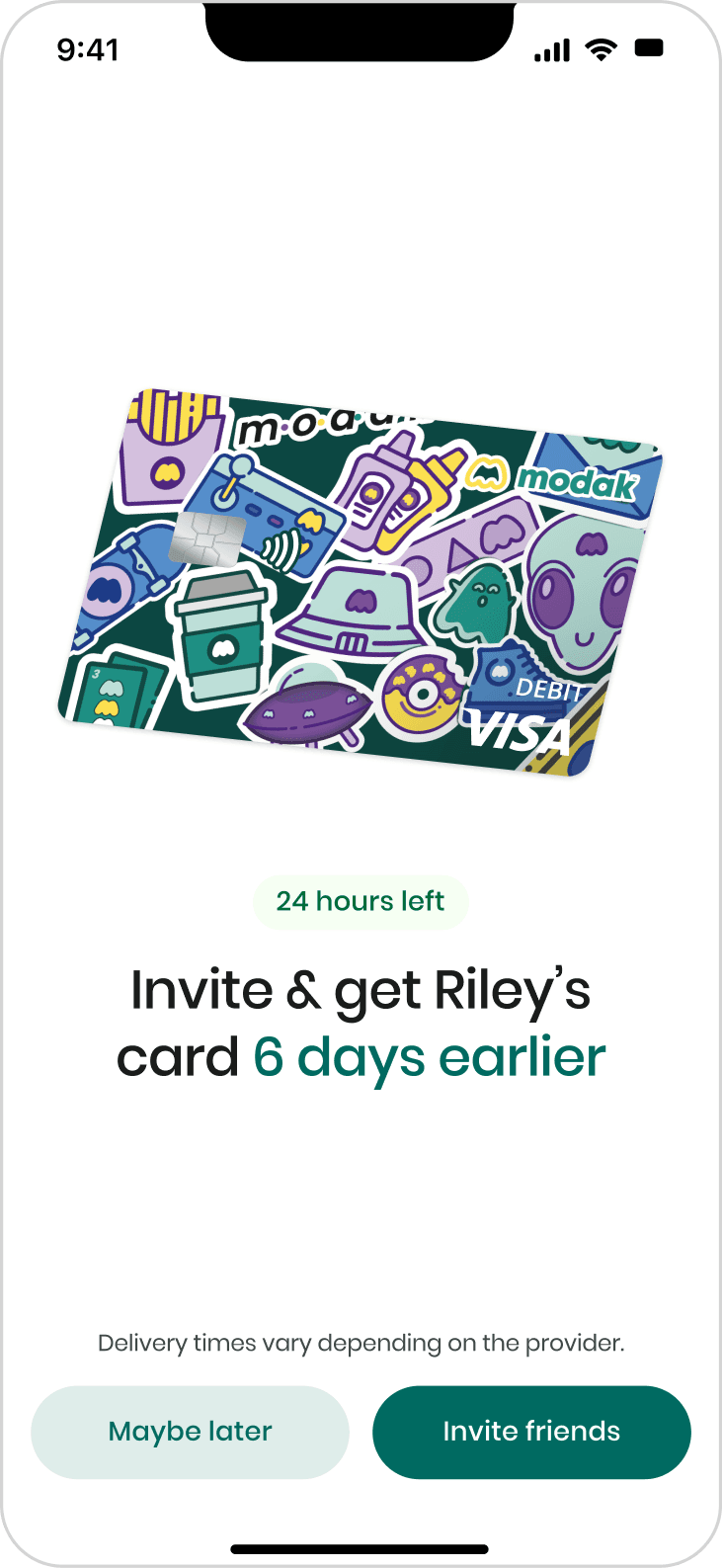

The team pushed for a two-screen progressive reveal: first ground the user in their expected delivery date, then present the offer separately with clear actions ("Invite friends" / "Maybe later"). The reasoning was that showing the expected date first, alone, would make the faster date on the next screen feel like a bigger deal.
I wasn't fully convinced - it added a step and the first screen had no exit path. But the logic made sense, and we went with it.


Design details
The final two-screen flow was built around a few key decisions, several of which I drove directly:
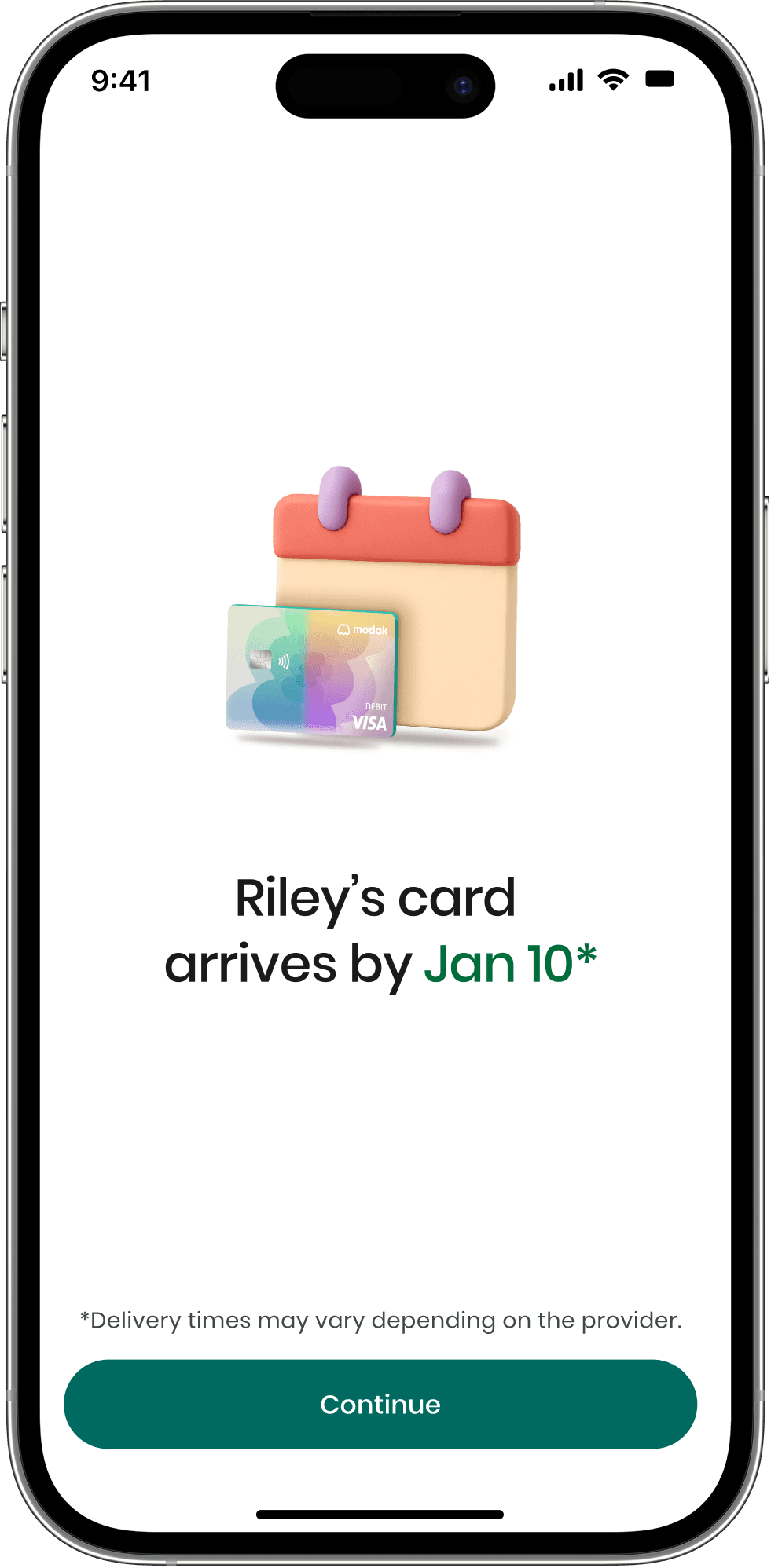
The first screen shows the child's card with their chosen design and a calculated delivery date - "Riley's card arrives by Jan 10." Only context, no ask.
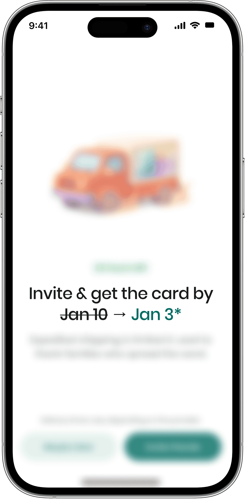
I pushed for showing concrete dates with a strikethrough ("Jan 10 → Jan 3") rather than a relative framing like "get your card 6 days earlier." Dates are specific, personal, and anchored to the user's actual timeline. "6 days earlier" is abstract. "Jan 10 → Jan 3" is a promise you can put on your calendar.

I also wanted the offer screen to be title-only, just the dates and the CTA. One stakeholder requested we add a description clarifying that expedited shipping was limited and used to thank families who spread the word. I felt it added friction to a screen that needed to be a quick, clear decision, but it addressed a real concern about setting user expectations.

A dynamic 24-hour countdown, tied to the actual card request scheduler, added urgency that was real, not manufactured.
3D assets
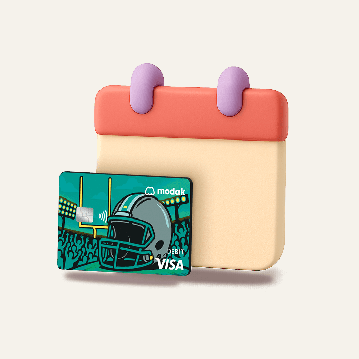
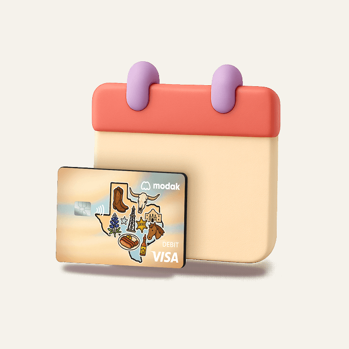
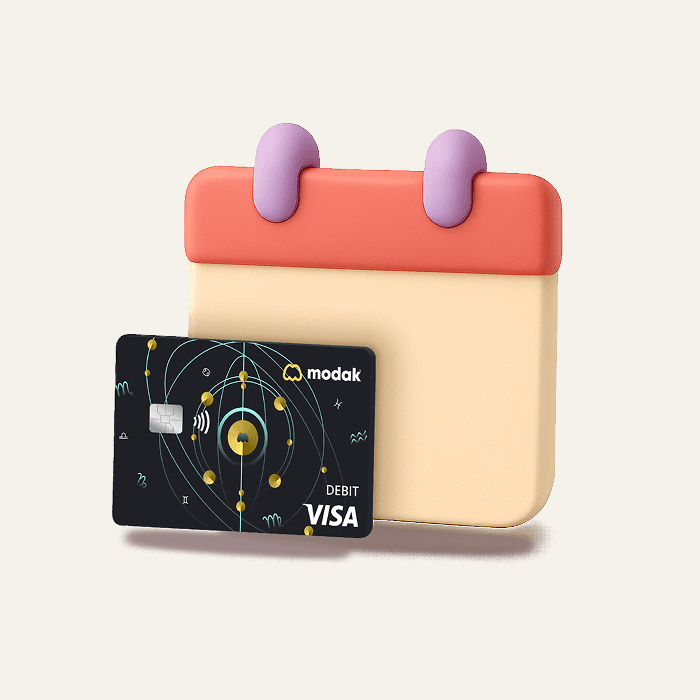
I also drove the visual direction for the 3D assets across both screens. I briefed our motion designer to create asset variants for every card design available:
a calendar holding the kid's chosen card for the ETA screen
and a delivery truck carrying that same card for the offer screen.
This meant both screens felt like a continuation of the personalization moment the user had just completed, not a generic system message. The truck was themed around speed (flames on the wheels) to reinforce the expedited delivery concept. Producing this required coordinating 20+ variants per asset.






Results


74.8% of first-time parents who completed KYC reached the offer screen, the remaining ~25% didn’t login in the first 24 hours after account creation.
Of those who saw the offer, ~50% tapped "Invite friends" - a remarkably high intent rate for a referral ask placed before any product experience.
During the experiment, the percentage of new parents who successfully referred someone (meaning another person actually signed up using their referral code) peaked at ~4.1%, roughly 2-4x the historical baseline of ~1-2%.
However, the incentive was structurally expensive. Expedited shipping costs significantly more than standard delivery, and the reward was granted at the very top of the funnel - before activation, before funding, before the parent had demonstrated any retention signal. We were absorbing a higher cost per user at a point where many would never activate.
What I learned: I was wrong about the intent
Parents do care enough about fast card delivery to engage with a referral ask before experiencing the app. The experiment validated the insight (expedited delivery is a high-value perk) while invalidating the mechanic (giving it away as a top-of-funnel referral reward).
We sunset the experiment and redirected the insight:
→ Expedited delivery became a paid option in onboarding
→ It was included as a MoGold benefit, offset by subscription revenue
Both of these exist today because of what this experiment taught us.
