27 nudges vs. 1 onboarding change
How we went from ~0% to 10% premium conversion
by concentrating the value proposition at the moment parents care most.

Context
Modak launched MoGold, a $5.99/month premium tier for families, with four core perks: no fees on instant funding, 4% annual boost on balances and savings goals, 2% cashback on kids' purchases, and a free physical card for parents.
As the sole product designer, I was responsible for the end-to-end MoGold experience - from the subscription value proposition to every conversion touchpoint across the app. I worked closely with the Nicholas Maskrey, our growth lead, on copy strategy and nudge placement.
Open door to phase 1
The nudge system that "didn't" work
If we show them the value everywhere, they'll convert eventually... right?
We launched with 24+ contextual nudges. Each tailored to the moment: paying a fee? "Save $1.10 on this transfer." Looking at savings? "4% boost to hit goals faster." Kid made a purchase? "Leaving money on the table."
The copy strategy followed two principles:
Always speak to the parent's immediate pain point: fees, speed, or earnings they're missing.
Always use "unlock" instead of "upgrade" or "subscribe" because MoGold could also be unlocked through a referral, so the language needed to stay open.


Version A leaned into aspirational messaging.



Open door to phase 2
The onboarding change that did it
The highest-intent moment was already in the flow. We just weren't using it. Yet.
The insight was simple but required a structural change: the highest-intent moment for parents is when they're choosing their kid's card design. That's why they came to Modak in the first place: their kid's debit card.
And we already knew the designs mattered: every time we featured them in ads, conversion spiked. If we could make that moment a MoGold conversion point, we'd be meeting parents where their motivation is already highest.


But doing this required rebuilding the entire signup flow. Previously, parents signed up on the web - creating their account, choosing their kid's card design, completing KYC, and then adding their kid to create the kid's account, all in one web flow before downloading the app.
Parent and kid setup steps were interleaved in a confusing way: card design selection (a kid step) was followed by KYC (a parent step) and then adding the kid (a kid step again). Parents often didn't understand why we were asking for their SSN right after they'd picked a card for their child - many thought we were asking for their kid's SSN.

We restructured it: all parent setup (account creation, KYC) stays on the web. Once complete, we prompt them to download the app. In the app, they add their kid, and then choose the card design - a moment we now control entirely.

The first move: the physical card fork
Before gating card designs, we introduced a decision point after the kid's virtual card was ready: to get the physical card, parents could either:
send $10 to their kid's account (a requirement to issue the card)
or subscribe to MoGold, which waived the deposit.
This was intentionally shipped first, it was simpler to build and let us test whether placing a conversion moment inside the onboarding would move the needle at all.




That gave us confidence to move forward with the bigger bet.
The bigger bet: card designs as a conversion lever
We made the two plain card designs free (Standard) and moved all 16+ illustrated designs behind MoGold as exclusive. Tapping an exclusive design shows the card, the perks, and a direct path to checkout - no "pick how to unlock" fork.
Early on, we had tested a "pick how to unlock" flow that let users choose between subscribing or referring a friend. The referral path generated intent but not completions, users who chose to refer rarely followed through. So we removed the fork and sent everyone straight to checkout, converting more of that payment intent into actual subscriptions.
If they do subscribe because of a card design, we show them they've unlocked 16 designs - reinforcing the value of what they just paid for. And in addition, MoGold subscribers get an expedited card delivery discount ($12.99 vs. $19.99) - connecting directly to the insight from the expedited card delivery experiment.


Result 3


The conversion rate of new users (KYC to MoGold payment) went from ~0.07% in early April to ~10% by late June - a fundamental shift. The growth came in two clear steps, each tied to a specific release:
After adding the funding requirement to onboarding: conversion jumped to ~5%.
After adding card design gating: conversion climbed to ~8% and stabilized at ~10%.



The breakdown by source confirmed that card designs became the primary conversion driver, surpassing the original MoGold intro screen and the physical card prompt.
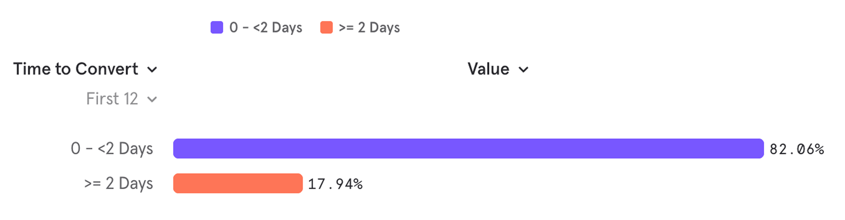
82% of all MoGold conversions happen within the first 2 days, during onboarding. The remaining 18% convert later, through the contextual nudges we built in Phase 1. Both matter, but the onboarding is doing the heavy lifting.
What I learned: more touchpoints ≠ more conversions
🥸
27 vs 1
Distributing value across 27 touchpoints felt thorough but wasn't effective. Concentrating the value proposition at a single high-intent moment, when a parent is emotionally invested in their kid's card, was dramatically more effective.
➕
Still in the game
The nudges weren't wasted work. They serve the 18% who need more time, and they reinforced the perception of MoGold as a benefit woven through the entire product, not just a paywall. But on their own, they weren't enough to drive a subscription decision.
👧
Follow the emotion
The biggest lesson was that the card designs (which had been free for everyone) were the most powerful conversion lever we had, precisely because they're connected to the emotional reason parents came to Modak in the first place.
